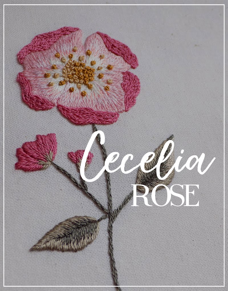
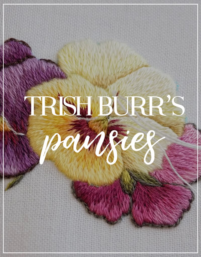
In the process of the recent Cecelia Rose stitch along and when it was complete, I received few letters which contained similar words and it almost broke my heart.
I know that needlepainting and long&short stitching, in particular, can be quite stressful and nerve-wracking, so hearing how some of you diminish your own results and go too hard on yourselves made me sad.
To be exact, some of you claimed that your shading was bad because the colors didn't merge that well in the leaves elements. What made me upset was that, in fact, your technique of long and short stitching was praise-worthy! Your efforts were clearly visible with all the stitches slanted in the same direction. But because the colors didn't blend together, and the difference between two colors was standing out, you thought you didn't do a good enough job.
So, today I would like to speak on this matter and say that merging and blending colors in needlepainting doesn't only depend on how well you do long and short stitching – sometimes the crucial factor is the choice of colors!
I also thought that it would be nice to have visual examples, so I prepared 5 cases to discuss with you.
But first...
Color Theory
We will not go in depth with this one (I'm still studying it myself, haha), but we will tackle some of the basic terms and notions, which we will need in this particular post. Bear with me for a while, okay?
The main colors you see on the color wheel are called hues. We know the primary hues – yellow, blue and red. They, in turn, produce other (secondary) hues when mixed together in various ratio. Namely, orange, violet, green and their versions (yellow-green, blue-green, etc.). Together they also form rainbow colors.
Rainbow colors = HUES
Now, few additional formulas:
Hues + white = lighter colors = TINTS
Hues + black = darker colors = SHADES
The so-called “blending” of colors in needlepainting is basically a stitched color gradient. If you ever tried making a gradient in any editing/painting software, you have a good understanding of what this term means. If not, search up “gradient” in Google, and look at the pictures – you will understand quickly.
Color gradient is a fluid transition from one color to another.
A gradient can be within the range of one hue, going from its lighter to its darker version. For example, from light pink to dark pink.
A gradient can also be a transition between 2 or more hues. For example, from yellow to blue. Then, it will go something like this: yellow → yellow-green → green → blue-green → blue.
This is all very basic, but quite enough for us to be able to discuss the topic today.
Color theory is a very interesting topic, actually, and there are wonderful books written on it, including the ones for hand embroidery and needlepainting specifically, so I encourage you to take a closer look when you have time. As for now, we will move to our cases.
Case 1
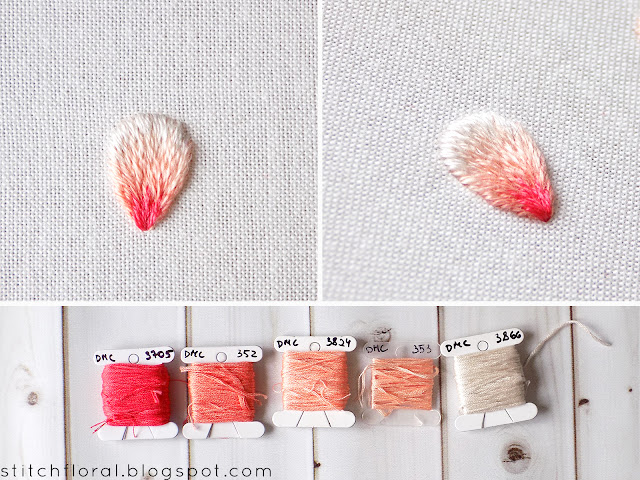
This is an example of a color transition within the range of only one hue.
If we take the lowest color (352) as a hue, then the two colors above are its tints – lighter versions. Although the pictures don't show it well, the upper color is, in fact, quite lighter.
This case could also be presented in shades, meaning with a hue and its darker versions.
This color choice is quite typical for long and short stitching and is the easiest way to achieve a good blending of colors. But notice, that for the natural blending, the colors should be very close to each other.
I would say that there is just one possible shortcoming of this color choice – it is a little bland? If you want a bit more “drama”, take a look at case 2.
Case 2
You can add a bit more drama if you add two contrasting colors on the ends: snow-white and crimson in this case.
Both are neither tints nor shades of the hue used in the previous case. But they are the extreme continuation on the ends. Lighter color turns into the white, and the base hue turns into the vivid crimson. And although crimson is quite far from 352 in color, it still works because the element is already busy with colors.
Instead of crimson I could've chosen a darker coral, or even brown – it would also contribute to the contrast and add depth to the element. But the vivid color creates more drama.
This type of color palette is also a good choice for needle painting and color blending but it takes more effort to work it, because the number of colors in higher.
Case 3
Now, this is the example of a "poor" color blending, because the border between two colors is pretty much obvious.
I stitched all of the elements rather quickly, so my long and short stitching here is not really perfect and exemplary, but it still worked for other elements and not for this one. Why? Because the colors are quite far from each other, they don't connect. They are neither tints/shades of each other. They are different hues.
This is the case when despite your efforts in long and short stitching, color blending might still fail. Not because of your technique! But because the colors are quite far from each other, so the border between them is still obvious.
AND IT IS OKAY. It's normal and just as valid as any other shading and in some situations, this could be the desirable and successful effect!
AND IT IS OKAY. It's normal and just as valid as any other shading and in some situations, this could be the desirable and successful effect!
Case 4
The cases above are probably enough, but there's just one more thing I wanted to point at.
Sometimes when you take few floss colors ranging from lighter to darker, like here, you think you found the perfect palette and they will blend splendidly.
But alas, the dark violet color here was too dark and didn't blend with the lower one that well – the transition is quite apparent.
Case 5
I changed the upper color and now blending is much more smooth, isn't it?
This example is almost identical to the first case, except it is reversed – darker up above and getting lighter at the base.
If I added white color to the base and the vivid violet to the top, it would add contrast and we would get a more dramatic effect.
To reiterate:
- Cases 1 and 5 are the “perfect” choices for color blending, where transition of colors goes smoothly. But they can seem a little bland.
- Cases 2 and 4 include more vivid or darker colors, which adds contrast and creates more drama. They are a bit catchier for the eyes.
- Case 3 is an example of shading between two different hues, where the border is obvious, but it can still look great!
Once again, in this post, I'm not trying to say "use these colors and don't use these colors" or "shade like this and not like that".
Not at all!
I just want to say, that color blending is a complicated thing and if colors don't blend perfectly it doesn't mean that you have a faulty stitching technique.
Don't be afraid to mix colors and experiment! Case 3 can be a winning choice in some situations and color blending does not always have to be smooth. Just don't be harsh on yourself and know that some colors will blend well and some will have an apparent border between them. Both situations can work and look great!
What do you think? Which examples attract you more? Which would you like to try? Share your thoughts!


