I'm back with another case study on needlepainting! It was a nice practice session for me, and I thought I should share the results with you :)
The first post on Needlepainting color blending tips turned out to be quite helpful to you, so I thought maybe I would update once in a while with various options for color choice and we would look together into how well various color combinations work together.
That being said, if you didn't read the first part yet, I definitely recommend checking it out before proceeding with this one. Because I covered some terminology connected with color theory there (hues, tints, shades), and if you are not familiar with these, it might be more convenient to start from that part.
So, here are our 3 cases for today and my thoughts on them.
Case 1
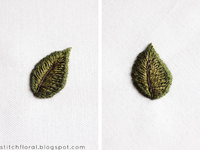
I actually expected a worse blending effect for this one, because the two colors are not so close.
On the inside there is dark green and on the outside we have a lime green, very bright and juicy. They are neither tints nor shades of each other, the hues are quite distinct, but the blending went well. It's because the length of the stitches was well varied, meaning the difference between the long and short stitches was quite apparent.
And also this color combination just works, doesn't it? I like this leaf most of all out of the three, because it is eye-catching and it draws my attention to it. It also creates more depth thanks to the difference of colors.
Honestly speaking, when I was first working this sample, I wasn't expecting it to turn out this way. I thought this would be an example of poor blending, but yeah... it proved me wrong! Another reminder to not be scared to experiment with colors, and take steps out of your comfort zone once in a while :)
Case 2
Here my choice of colors was a bit off again, to be honest. When I picked the color for the inside my intention was to use a tint for the dark green (its lighter version). But it is not really, it has a more earthy vibes and is closer to olive hue.
The blending went fine, I think. But if we speak on the overall impression, then this one is more modest compared to the first case. It reminds me of forest, oak trees, cones, and rain. It is definitely not as catchy as the first one, but it has a calm and soothing aura and there are situations where it will be the desired result.
Case 3
Now I tried to combine all three colors, although I knew it wouldn't have much success, haha. I was wondering if I could achieve a dimensional effect here. But having no real tint or shade, only 3 different hues, it didn't go that well.
The left side of the leaf didn't turn out that well because my long and short stitches there didn't vary enough to create a balance. They were almost the same length so the blending didn't work that well.
On the right side, the long and short stitching is better, but because there are different hues (dark green to olive green to lime green), the 3-D effect is worse than it could've been if I used tints for example (dark green to green to light green) or if I used a medium color between dark green and lime green.
With that being said, I don't mean that different hues are a no-no for creating more dimension and depth! Quite on the contrary, I believe that using only tints or shades might make the gradation of colors a bit bland.
I'm still exploring this aspect of needlepainting and how various colors work when combined together for long and short stitching. It is an interesting topic and I plan to make these posts a series and share all my practice with you, guys! Hope it will be helpful for you just as it is for me.
What is your opinion on the 3 leaves? Which one attracted your attention more? Which seemed more balanced and which was a bit off? Share your impressions below :)


